Back
Mobile app // Redesign // Fintech
PrimaryBid
Duration
2022 - 2023
Role
Senior Product Designer
Team
2 PMs
2 Developers
2 Designers
2 Developers
2 Designers

✧
THE PROBLEM
The old app suffered from low retention and limited engagement due to a lack of live share offers and poor clarity around its purpose for new users. Existing users also find it difficult to locate the information they need, with key details buried in the interface.
70%
of new users don’t finish onboarding
40%
sign in once and then never again
✧
THE OBJECTIVE
Clarify value proposition
Clearly communicate what the app is for and how it helps users invest, ensuring new users quickly understand its purpose.
Enhance information access
Make key investment details easy to find and digest, reducing friction in the decision-making process.
Boost new user confidence
Give users access to a 'demo' version of the app to view recently closed offers before committing to signing up.
Drive retention and engagement
Create a smoother, more rewarding user experience that encourages users to return and invest regularly.
✧
THE SOLUTION
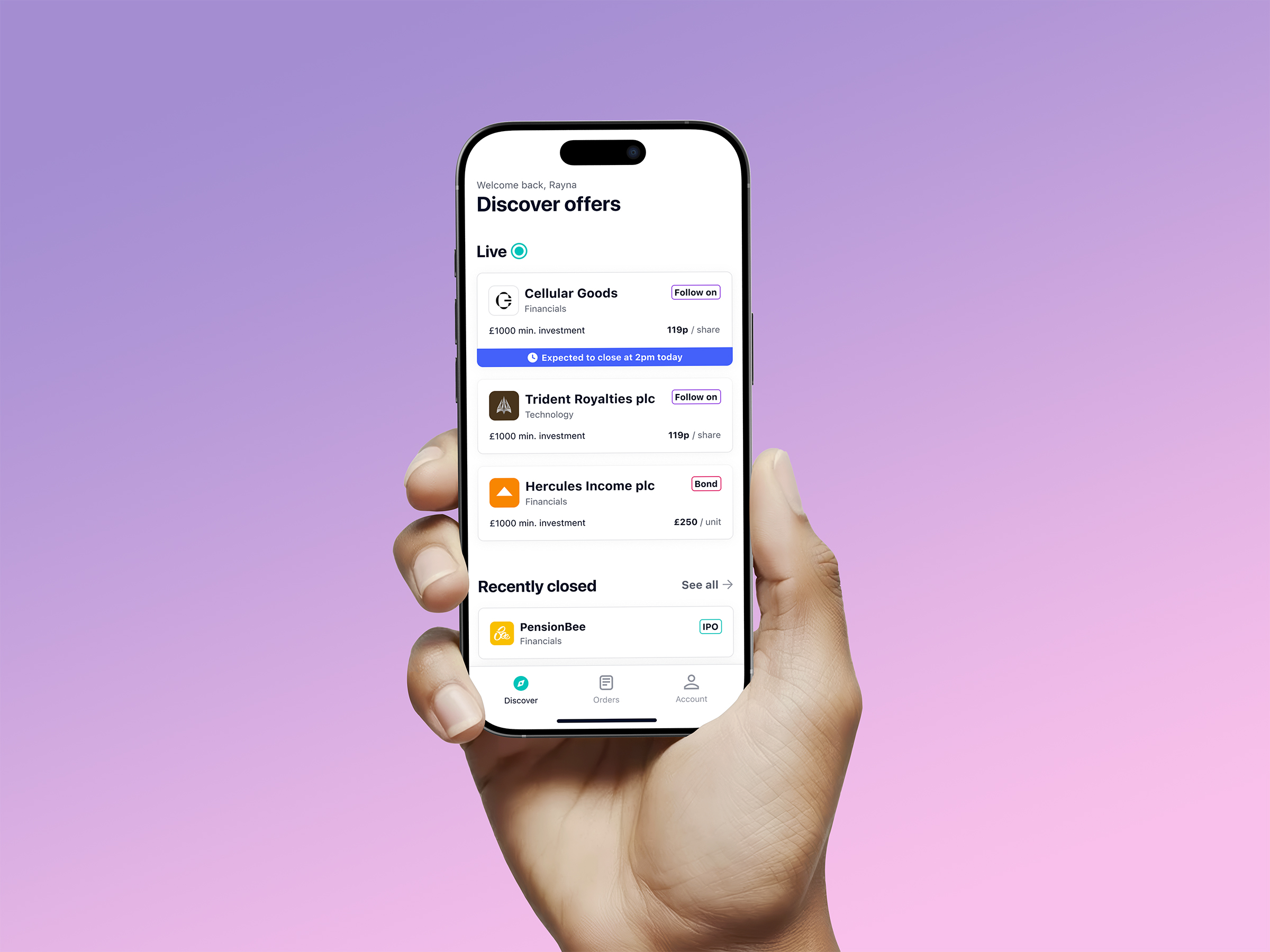
Discover/Home screen with live offers after the user completes onboarding
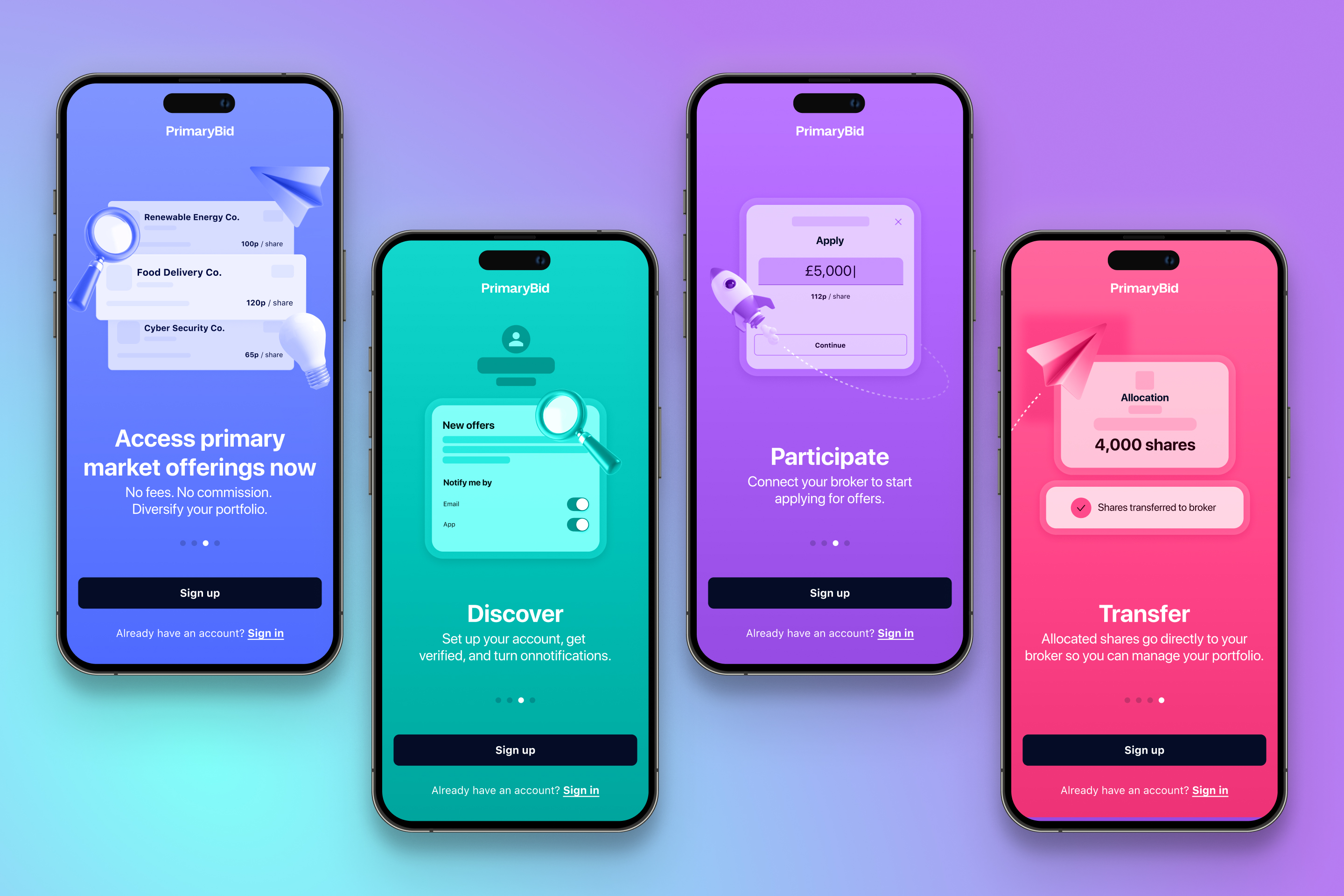
Splash screen carousel highlighting key features of the app
.jpg)
New offer details page with sticky navigation
.jpg)
We gave the user multiple steps to exit onboarding early so we didn’t lose them later on.
Left is a ‘demo’ version of the app they can access directly after confirming their email.
Right is the full app but without the ability to invest unless they add their broker details and complete onboarding.
Left is a ‘demo’ version of the app they can access directly after confirming their email.
Right is the full app but without the ability to invest unless they add their broker details and complete onboarding.